Monday, 27 July 2009

Urban Farming and Apocalypse Chic


Dalston Mill, London, 2009. Photo from Londonist.

When I was researching my recent feature on urban farming (Icon 072; not online yet, sadly), the same name kept coming up: Cuba. Cuba, it was said, was the face of the future: urban populations were effectively supplementing their diets from smallholdings within city limits, and were doing so with high yields achieved without agrochemicals. I now read on Carolyn Steel's blog that this isn't strictly true: Cuba's urban farms supply only 5% of the nation's food, and 75% of Cuba's farmers use agrochemicals. More would if they could. It's a great shame.

This is a problem with urban farming that I hinted at in the piece I wrote for Icon 072 and didn't really have the space to explore fully. Urban farming was forced on Cuba; whatever its admirable achievements, I'm sure many of those courtyard smallholdings would become carparks with the end of the economic crisis. They are a contingency measure until better times arrive.

Now, there are very good reasons to grow more food inside cities, and to encourage people to grow some of their own food where they can. We do not want to continue to be at the mercy of a bloated, destructive and wasteful industry that gulps petrochemicals, destroys ecosystems and ruins the lives of thousands. As well as being ethically ropey and bad for our health, the food industry is very fragile, with long, tenuous supply lines and vast resource requirements that make it very vulnerable to exogenous shock and sudden collapse. Our dependence on industrialised food is a huge risk; self-reliance, on an individual and civic scale, is a virtue.

But the proponents of urban farming often muddle up doing it because we must (that is, we face shortages if we do not) and doing it because we should (self-reliance being a virtue, food security being desirable and so on) - necessity and desirability. And it's the questions of necessity that tend to be the most powerful arguments: no one wants to face shortages. But if people see urban farming as only a necessity, it will only ever be seen as an emergency response to a crisis, to be rolled back when (if) more secure times return. This appears to be the condition Cuba is in. But that simply sets society back on the road to consumer-dependence of food produced invisibly elsewhere.

Moving to a more diverse and stable system of food production - including some urban farming - has to accent that is is a desirable option in good times and bad.

Hipsterising the Eschaton
Which brings me to the second prong of this pitchfork argument. I'm not terrifically impressed by the Barbican's "recreation" of Agnes Denes' 1982 urban art installation Wheatfield - A Confrontation. Here's a gallery of pictures from Londonist, including the one I borrowed at the top of this post; here's a gallery from the AR. Maybe I'm missing something, maybe it the photography. But it strikes me as pitiful. Denes' original was a flowing field on a sweep of land worth millions of dollars, with Manhattan as a backdrop. This "recreation" is a mangy rug in an enclosed patch of Dalston. It lacks all of the impact of the original.

But the purpose here is education as well as spectacle. It's a demonstration of urban farming; the wheat produced by the field will be ground in the windmill that has been built on site by voguish French practice EXYZT. Sadly, the windmill is not at all interesting. It is simply a windmill. The project has some merit in that it gives a small idea of how urban food production could be integrated with public social space.

But the aesthetics are, regrettably, an instance of apocalypse chic. For some reason, when young architecture practices confront the planet's combined crises, the reference tool they reach for is Mad Max rather than, say, anything attractive or optimistic. In an effort to make the project visibly post-crisis, it is deliberately informalised, made to look uglier, cheaper and more improvised than it could be. In order to make this palatable, it is made to be "fun", usually by installing a turntable. The overall idea appears to be to suggest that the chaotic transition from petroeconomy to whatever comes next is going to be like some kind of hipster yard party.

This deliberately informalised approach is delusional and counterproductive. It just makes necessary measures look like transitional patch-ups and workarounds, in place until normal service is resumed. It falls into the trap I described above, appealing to necessity rather than desirability. Why stick with this jerry-rigged arrangement when we could build version 2.0 of the industry that has given us individually wrapped bananas airfreighted from Kenya and the Turkey Twizzler?

You might argue that transitional jerry-rigging will be necessary for a time, and the aesthetics come later. That's not a bad point, but we know how to build a windmill out of scaffolding, and we did not need EXYZT to show us. Architects should be busying themselves with making a post-crisis future appealing, and doing so in a way that stretches beyond putting in a turntable. The model should be post-War planning, utopianism, not Waterworld. The future should be well-made and attractive.

Thursday, 23 July 2009

A Stress-Test for the Human Spirit


The following is the short "icon of the month" article I wrote about JG Ballard in the wake of the author's death in April. This article appeared in Icon 073 (July 2009), which you can buy online. In common with many of my peers, Ballard's writing had an enormous effect on me. As I wrote in a paragraph that was eventually cut from this piece: "Everywhere one turns, the 21st century matches up to what Ballard sketched out in his work: televised cosmetic surgery, dogging, youths filming assaults on mobile phones, public space submerged by CCTV-covered 'retail experiences', and the omnipresent whiff of imminent collapse."

I'm grateful to Simon Sellars, who saw a version of this article and fed back a couple of useful comments. Also, references have been included where appropriate. Image via Sit Down Man.


With the death of JG Ballard in April, modern architecture lost one of its strangest and most powerful advocates. Strange, because many of his novels look like attacks on built modernity. The Atrocity Exhibition, the 1969 book that established Ballard’s literary reputation, is a vivid, harrowing collage in which freeways, concrete towers and multistorey car parks are intercut with flashes of sexual violence and popular culture. This imagery was returned to in depth and force in the infamous 1973 follow-up Crash. The modern cityscape is at the centre of subsequent novels. In High-Rise, inhabitants of a luxury tower block devolve into warring tribes. In Concrete Island, a man is stranded on a reservation between motorways and turns savage. Running Wild, Cocaine Nights and Super-Cannes explore the darkness that ferments inside gated communities, and in Kingdom Come, the controlled environment of an out-of-town shopping centre becomes an incubator for fascism.

But Ballard loved modern architecture. His favourite building in London was Michael Manser’s 1992 Hilton hotel at Heathrow airport – a slab of international style with a dizzying glass atrium. “Sitting in its atrium one becomes, briefly, a more advanced kind of human being,” he told Hans Ulrich Obrist in 2003, echoing Marc AugĂ©’s message that antiseptic non-places, in particular hotels and airports, give us a glimpse of an anonymous future city-world. By contrast, Ballard dismissed the rest of London as a stucco-choked instrument of political control and class repression, possibly the only world capital “that has gone from the 19th century to the 21st without experiencing all the possibilities and excitements of the 20th in any meaningful way”.

It was the modernist attempt to dispose of all this baggage of class, history, received wisdom and social prejudice that Ballard admired. In in-between spaces and non-places, Ballard saw an architecture that appealed to the immediate here and now, the instant, as opposed to bowing towards some abstract posterity or an idea of taste. We are at our most free in the non-place, the atrium, the departure lounge, on the motorway. There, it doesn’t matter who you are – the only thing that matters is where you’re going. And that’s precisely why the authorities are so desperate to monitor us in those places.

Being able to leave behind who we are also means that we are freer to indulge psychosis and sexual outrage – but that was no argument to remain unfree. Writing about architecture in 2006, Ballard mentioned the demolition of the Pruitt-Igoe housing project in St Louis in 1972, an event often cited as heralding the death of modernism. The estate had been condemned as a “social catastrophe”: “However, I sometimes think that social catastrophe was what the dirt-poor residents secretly longed for.”

Our inner urge towards destruction is Ballard’s stock in trade. The architectural criticism in Ballard’s novels amounts to a stress-test for the human spirit, just as an engineer might test a steel frame to destruction. He shows that what we think of as “normal” activities and environments are anything but – that we are constantly pioneers in our own relentlessly strange world. Our surroundings define us, and in turn our neuroses shape our surroundings. He probed, more intimately than any other writer, a fundamental question: how can we be free when we cannot escape our containers – that is, our bodies and places?

Monday, 20 July 2009

Urbanism Sells


Is this the first time in history that "Fragrance: Urban" is seen as a positive thing?


And the expensive Danish modern furniture shop Boconcept has taken to asserting its urban-ness. It's something that I've been noticing more and more. Take Nespresso, for instance, the cartridge-based coffee system from Nestle. (Link will start music playing; mute speakers.) It could be argued that Nespresso is fairly strongly attached to the city, as it's hard to imagine its capsules being retailed outside major conurbations. (You can order them online, though.) Nevertheless, this year it launched Citiz (again, music), a Nespresso unit intended to be specifically urban.


I wrote about Citiz for Icon 071 (May 2009). The design, by Antoine Cahen, is interesting enough. What's most interesting are the identifying "urban" features: it has a small footprint for small kitchens, its name is spelled in a way that suggests collapsing educational infrastructure graffiti tagging, its colour pallette is "urban", and its profile intentionally resembles a skyscraper. This similarity in profile is heavily pushed home by the unbelievably slick animated introduction to the ">Citiz website, which is really worth watching. Skyscraper, maybe, but with that rounded top and gleaming metal it's Beaux Arts, Deco or 1980s Pomo - a Chrysler or Singer building, or the old Barclays building on Lombard Street - nothing with unfriendly Miesian corners. Nespresso hired semioticians to consult on the Citiz; they pushed "humanising" features, making the controls more like a face. It's truly strange how things end up looking the way they look.

I'm straying, however, from the main thread of this post, which is the use of the word "urban" in a marketing context. Over the past 10 or 15 years, it has been presented as an indicator of the success of urban renewal that city centres have again become desirable places to live and that Thatcherite slur "inner-city" has lost its sting, replaced with some of the marketing I've shown above. Urban became young and hip - urban was marketable. Have a look at the website of Urban Living, an estate agency that claims to have been among the first to recognise emerging demand for "dwelling in the city". White-painted and modern! Central! Urban!

When we're told a thing is something, we're also being told that that thing is not something, and therein often lies the fib. Look at the use of words like "natural" in the context of ads for things like shampoo and food - it invites the mind to think "not artificial, not processed, not unhealthy". And therein lies the fib - so-called "natural" products are often all those things.

So when we're told something is "urban", what is it not? Rural, yes, but more importantly it is not suburban, and it is not the world of small towns and dormitories. "Urban" is not those things - it makes a broad claim to a certain level of vibrancy, cultural activity and hipness. The marketing usefulness of the word "urban" works both ways - estate agents like the one linked above, regenerative property developers such as (obviously) Urban Splash, and the government's own regeneration initiatives trumpet urban-ness.

It's a tendency that seems deeply rooted in anxiety about the places these organisations are involved in building and selling. As Jonathan Meades says in the wonderful On The Brandwagon, these places are very often central, but not urban. They're modern suburbs, exurbs even, with limited community or cultural activity, but situated in the urban core. They're insulated bubbles of dormtown deadliness dangerously injected into the bloodstream of the city. The connections, interdependency and social capital that have defined city life are absent, perhaps even purposefully minimised. Regeneration, Meades concludes, means no rioting within the ring road.

And inside the riotless entryphone zones, we have rootlessly mobile "young, hip, urban" professionals listlessly buying FCUK bodywash, Boconcept sofas, and Nespresso Citiz coffee machines in an effort to reassure themselves, yes, this is the city, we're urban, we really are. Like fresh, like natural, it's a vast marketing fib.

Wednesday, 15 July 2009

Bling Bust, Bling Books


Six months' worth of Icon magazine has just been archived online, including various pieces by me.

"Behind this bloodletting, a revolution is taking place. What is dying is a distorted idea of luxury design that reared up monstrously in the debt-fuelled consumer boom of the past decade. ... Luxury can save the design economy. And it can do it sustainably." -- "Will the Crash Save Luxury Design?", Icon 068, February 2009

"In 1999 he published SUMO, a retrospective of the work of photographer Helmut Newton. This beast was the largest book produced in the 20th century: 50cm by 70cm; the Vatican's bible binder had to be called in to help make it. It came with its own stand, designed by Philippe Starck. Although the 10,000 copies of SUMO sold at a mere £6,000 each, edition number one (signed by 80 celebrities) later sold at auction for $304,000 - the most expensive book produced in the 20th century." -- Interview: Benedikt Taschen, Icon 067, January 2009

"Petit's coup can never be repeated, not just because the towers are gone, but because public suspicion has increased, and control of public space has tightened. It is odd, and unnerving, to look back on late Nixonian America as a more innocent age." -- Review: Man on Wire, Icon 064, October 2008

Some icons of the month: The Lightbulb, Modulor Man and SimCity. And a rant, against the disposable razor.

Monday, 13 July 2009

Major Project 1: Care of Wooden Floors

From time to time I mention that I'm writing a book, or I post an update on how it's going on Twitter or Facebook, and someone asks me what it's about. I am not very good at exciting one-sentence summaries: In the past I have described it as "an episode of Some Mothers Do 'Ave 'Em written by Franz Kafka", "a sort of satire on minimalist interior design" and "a little like Mon Oncle vs Lost In Translation". When I don't feel like talking about it I say "it's about looking after wooden floors". I often wish I had a detailed description that I could link to. This is that description.

The book is called Care of Wooden Floors. That's a working title that stuck. At time of writing, I have completed 67,000 words against a target of 75,000. It's non-genre literary fiction.

Oskar is a Mitteleuropan minimalist composer best known for a piece called Variations on Tram Timetables. He is married to a Californian art dealer named Laura and lives with two cats, named after Russian composers, in an Eastern European city.

The book isn't really about Oskar. It's really about Oskar's flat, a glorious haven of minimalist design, with Mies van der Rohe furniture, white walls, a stainless-steel kitchen and exquisite wooden floors. Oskar is in Los Angeles, having his marriage dismantled by lawyers. He has trusted an old college friend to look after his perfect, beautiful flat. Despite the fact that Oskar has left dozens of surreally detailed notes covering every aspect of looking after the flat, things do not go well.

Care of Wooden Floors is about how a tiny oversight can trip off a disastrous and farcical chain of consequences, and destroy an exceptionally expensive floor. It's about the relationship between two men who don't know each other very well. It's about alienation and being alone in a foreign city. It's about the quest for perfection and the struggle against entropy. It's about the influence our homes have over our lives. And it is, a little, about how to take care of wooden floors.

Saturday, 11 July 2009

The 7 July Memorial


Peter Beaumont's new book The Secret Life of War features a glimpse inside the bedroom of a Palestinian teenager. On the wall are photographs of suicide bombers and ... Princess Diana.

Surreal! Not really. This is a juxtaposition that makes perfect sense. The teenage bedroom is the vector that connects Princess Diana with suicide bombers. There's the misplaced fascination with the Cobain glamour of untimely death, of course. There's also the puerile appeal of fairytale happy endings, be they marrying Prince Charming or getting to know 72 virgins. "Happy ever after" and self-annihilation are both forms of an unwillingness to project oneself into the future. They're equally at home in the native territory of nihilist self-importance and melodrama, the teen bedroom.

And now they're equally at home in Hyde Park. Kathryn Gustafson's Diana Memorial Fountain has been joined in the park by Carmody Groarke's 7 July Memorial, commemorating the 52 victims of the 2005 bombings.

It feels rather uncomfortable to criticise a structure like this, as it is now the appointed and inviolable symbol of the suffering of London and the bereaved families in the wake of the bombings. Obviously no disrespect is intended. Criticism is made even harder by the memorial's overwhelming politesse, its quintessence of the sort of minimalism that is now pervasive in memorial design, as discussed by Kieran Long in this essay in Icon 044.

My arguments here aren't primarily aesthetic, or intended as criticisms of the designers, who have been working to an exceptionally sensitive brief, although there are some aesthetic points that I'll come to at the end. Rather, I'm concerned with the location and purpose of the memorial. I'm also, as is always the case on this blog, speaking for myself, not for my employer.

Alongside the Diana fountain, it's clear that Hyde Park is now seen as a suitable location for this sort of large-scale public memorial. This is unfortunate, and represents the chipping-away of a public place of repose. The park has nothing to do with any of the bombing locations, or there common feature, public transport. Andy Groarke justified this choice to me by saying that it was unwise to prioritise one location over another - which is a reasonable response, though I'll return to that argument later. There's also the question of what the memorial has done to part of the park. There are benches as part of the landscaped area memorial, but they are a distance away from the columns. As Groarke said when I interviewed him:

The families wanted four benches, but we didn't want to make that part of the memorial for a few reasons - we didn't want to make the memorial solely as an amenity to the park, its remit isn't to provide a place of comfort, it's to communicate a message, a message in memoriam, so we wanted to put the benches slightly off it and have the strength of the memorial as a singular and collective thing. So the benches are placed aside, so a visitor to the memorial can contemplate quietly, inconspicuously, at a little bit of distance.

The designers have gone to pains to ensure that the memorial is hardwired into the fabric of the park, and simultaneously is not a place of rest. Another part of the park has been turned into a modulated emotional terrain. In contrast, the memorial to the 191 victims of the 2004 Madrid train bombings, an underground chamber linked to but separate from Atocha station, is a discrete (and discreet) place of contemplation.

Then there's the scale. "It shouldn't be put on a plinth, this memorial," says Groarke, drawing attention to the composition's intended modesty and its integration into the "ambient parkscape". Nevertheless the location, at the head of two paths, is undeniably Grand Manner, and the individual columns are 3.5m tall, twice the height of a man. Plinth or no plinth, the scale is monumental.

Why does this matter? Beyond my discomfort with (another) part of the park being turned into a funerary complex, the grander and more prominent we make the memorial, the more importance we accord to the attacks. They were a nightmarish experience, to be sure, and that memory is but a fraction of what the victims and their families suffered. But we have to remember the teenager's bedroom, the terror-fancier's love for melodrama and hollow spectacle. Grandiosity is not a sensible response to that.

Finally, aesthetics. On Twitter, architect Sam Jacob hit out at its "inappropriate, empty, good taste". It is certainly minimal, preferring to leave a blank in place of a more articulate message, a politically tactful move that is also the plague of modern memorials (cf Long, above), allowing visitors to fill in their own thoughts. Silence is not a bad thing in itself, but when it's on a large scale it is open to accusations of emptiness. Nevertheless, if monumental memorial there must be, I would prefer minimalism to the figurative kitsch of the atrocious and heartless Animals in War memorial, on nearby Park Lane, or the slightly less dire Women at War memorial on Whitehall. (The latter of which always reminds me of Dominic Wilcox's War Bowl, made of melted, mashed-together plastic soldiers.)

Its site might be an irreversibly poor choice, the scale might be off, but there are some redeeming features to the memorial. As I mentioned earlier, one of the reasons the location of the memorial is troublesome is that Hyde Park has nothing to do with the one thing that all the victims of the 7 July had in common - they were users of public transport. Public transport is London's greatest shared experience, which is surely why it was targeted in the first place. The memorial makes conscious reference to this in one way, with lettering designed by the superb Phil Baines based on the TfL font, Johnston.

There is another connection with transport that I do not believe the designers intended. The plain, unpolished steel columns resemble the utilitarian poles and supports that are everywhere at roadside and trackside, serving scores of functions.

These utility poles are already the basis of a genuine folk memorial culture - the bunches of flowers, and sometimes other artifacts such as soft toys, that appear after deaths on the road. What we can see in Hyde Park is a government half-heartedly "giving people what they want", and sacrificing public space to do so, but then failing to do the whole distance and instead trying to channel popular emotion into a narrow prescription of "good taste". Really, if the state wanted the 7 July memorial to be the focus of genuine popular emotion, let those who come to pay respects attach flowers and tributes to the stelae. Let cable ties, cellophane and cut flowers bloom.

Tuesday, 7 July 2009

Olympic Ramble

These are some photographs taken on a recent walk around part of the perimeter of the Olympic site in east London. The walk was part of a Constructing Sites workshop organised by Gesche Wuerfel at Goldsmiths University's Centre for Urban and Community Research, with the photographers Tristan Fennell and David Kendall. It was a scorching 27 June, and what these photographs don't show is me getting horribly sunburned.


Hackney Wick.


Gate, and tower of unknown purpose.


A peek through the above gate. A distinct sense of post-zombie-apocalypse military checkpoint. That said, some of Hackney Wick looks like that all the time, only without the blue fencing. The blue fencing - immortalised by Iain Sinclair, here - reminded me very strongly of the sky-painted utopian housing in Terry Gilliam's Brazil.

Brazil picture from this magnificient site.


However, the fence is being taken down and replaced with a more straightforward electric fence, seen here behind an outer non-electric safety fence, which will weed out the less determined and stupid miscreants.


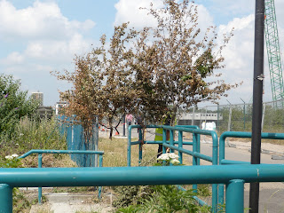
A small stretch of blue fence is still there, deviating around some trees in the sort of highly visible micro-courtesy that often serves as a shield for some obscured Godzilla incourtesy. Still, it's sort of charming.


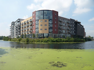
Regeneration, in all its glory. It was algae mardi gras in the canal. There was so much photosynthesis going on it almost felt wrong to look.


A bosky-looking jetty. Good graffiti, too. Graffiti on the blue fence was overpainted in hours, but aparently it has surged in the surrounding area. An outer ring of paint, symbiotic with the inner ring of blue paint.

It looks a bit angry.


Artists' studios in warehouses.


Surreal suburban interlude. This is the house they used to film the Big Breakfast. The blue fence passes right through its garden.


Security as insecurity. Picket fence, security fence, razor wire, and that's before you get to the actual perimeter. West Ruislip meets the West Bank. At right: Tristan Fennell. Top right: the stadium.


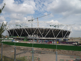
The stadium. You can order that brickwork by the square foot. But the white steel will cost you.


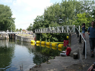
Anti-canoe measures where the River Lea meets the Lee Navigation (Hackney Cut).


Anti-climb measures, with the stadium behind.


Left to right: Tristan Fennell, Gesche Wuerfel and David Kendall. Behind: perimeter patrol in high-vis with alsatian. David said that photographers in ones and twos often get stopped and told that photography of the perimeter is not permitted (a fallacy). We were not bothered, presumably because there were a dozen of us, not including the film crew. I'll link to the film when it's cut together.


The patrol passes over the Lea bridge after declining the opportunity to be photographed. The fellow in the red shirt is sketching - I don't know if that's allowed or not.


Regeneration. My wife tells me that the feng shui of this building is radioactive, with the pointy bits jutting over the water or something.


The Northern Outfall Sewer just before it becomes the Greenway.


"J.W. Bazalgette, Engineer." Yes he was.


The stadium from the Greenway. Impromptu office buildings in the foreground.


Here you can see part of a scaffolding causeway connecting the site with the Greenway. It's a bad photograph because some security gentlemen became very agitated when I attempted to take a good photograph.


London Concrete, with Canary Wharf a surprisingly long way in the background.


View over the site's main vehicle entrance. I assume it was the main vehicle entrance, because there was a vast amount of traffic - a constant stream of lorries, plant and buses entering and leaving. This was on a Saturday. There was a terrific sense of industry and urgency. In the background is the skeleton of Zaha Hadid's Aquatics Centre.


The stadium. In the foreground are some brightly coloured hoardings with commands directed at site-workers on them: "Be Aware!" "Be considerate!" "Be responsible!" Construction workers are always harangued like this, but it's a distinctly authoritarian touch in the Olympic typeface and the New Labour fluorescent palette. DCMS meets DPRK.


A closeup of the Aquatics Centre. I generally try to avoid "alien spacecraft" cliches, but it could be Battlestar Pegasus in the shipyard.


A stretch of the Greenway that had been popular as a viewing area had been fenced off - more nibbling at the public realm. Security men stood watch.


It was hot - very hot. There is little shade on the Greenway. The security guard who was watching the former viewing area had improvised a little shelter by attaching fallen branches to a fence. Not an enviable job, standing there all day.


Who's this "us"?


Into "the labyrinth", where the Greenway has been closed and pedestrians have to pass through what amounts to a security checkpoint in a dogleg bend.


Inside "the labyrinth". Places like this are fascinating. I'm increasingly interested in the subject of zones and the disintegration of the city's public space into a patchwork of varying legalities. Our state society is becoming increasingly fixated on identity, ID. This concern is presented as a result of concerns about terrorism (of course), but also as a way of safeguarding "our" rights so that they're not "abused" by people who don't belong in the magic club of citizenship. Look at the first groups affected by ID card legislation - foreigners resident here, and airline/airport staff with access to the sacred "airside" zone - simultaneously one of the most secure and insecure places in the UK, the place we overlap with the rest of the world. Anyway, ID obsession is no way of guaranteeing rights, it's a way of denying them, ultimately breaking the whole city and country into spaces where people "belong" and (more importantly) "don't belong".


At the moment, with little ID infrastructure in place, when you're in a semi-public but highly controlled space like "the labyrinth", the authorities are forced to assume that you belong. They hate this. With an ID infrastructure in place, they're safe to assume that you "don't belong", and the onus is on you to justify your presence there. In places like "the labyrinth", we can see the architecture and mechanisms of this infrastructure being rehearsed. It is at its most developed, I think, in the West Bank.


David Kendall in "the labyrinth".


Something a bit Wild West about this gate. Appropriately, it was High Noon.


A bowser spraying water - I think to keep down dust.


On the left, one of the ugliest buildings in London. Portacabin aesthetics.


For pity's sake, that's atrocious.


The Fence absorbs a signpost like some spreading alien presence out of early JG Ballard. No through road.


I love this photograph. The church is gone.


Lock-keeper's cottage, a bizarre survivor just off the ultra-urban main road into Stratford. New security infrastructure keeps an eye.


Greenway fact: Gandhi like to walk along it when he was a law student in London before the First World War.


The fence was punctured up ahead - they appear to be building a jetty for accepting deliveries by barge. We went to have a closer look.


The path along the riverside had been blocked by The Fence, and the fly-tippers have moved into its amputated remains. Some fibreglass cornices from an obsolete effort at home improvement.


Fly-tippers. The filth here was indescribable.


RIVER. Plus blocked archway, as if it has been filled in with that coloured gunk dentists use.


This was the only Union flag I saw on the site, which was something of a surprise. I expected more national symbols.


I only saw one of these, as well - inconspicuous, bolted to the end of a crash barrier. An early hint at future walking routes, or a leftover from an old route now truncated. We terminated the walk at Pudding Mill Lane and went to Greenwich for lunch and to discuss the day.

There are more photographs on my Flickr stream.